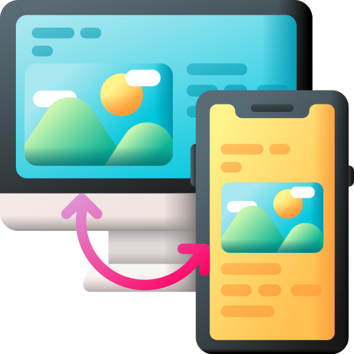
Mobile devices account for the overwhelming majority of global web traffic, yet many web applications continue to be designed with a desktop-first mindset, merely scaled down for smaller viewports as an afterthought. This approach creates disjointed user experiences and frustrates mobile visitors.
True responsive design goes far beyond making elements smaller. It requires deeply rethinking layout structure, visual hierarchy, and interactive patterns based on the specific context of the user. Factors such as thumb reach zones, minimum touch target sizes, readable typography scaling, and simplified navigation flows are critical for mobile usability.
Good responsive craftsmanship also protects your search engine optimization (SEO) performance. Search engines prioritize mobile-friendly web experiences when ranking pages, meaning that a subpar mobile layout directly penalizes your organic visibility and traffic acquisition.
Adopting a mobile-first philosophy from the very inception of a web project is dramatically cheaper and more effective than attempting to retrofit responsiveness into an inflexible legacy codebase later. Prioritizing fluid grids, flexible images, and CSS media queries ensures your platform delivers a polished, cohesive experience across smartphones, tablets, laptops, and ultra-wide desktop monitors alike.
🎨UI/UX DesignJuly 12, 20265 min readTrunetic Team
Why Responsive Design Still Matters in 2026
More than half of all web traffic comes from mobile devices. Responsive design is the difference between capturing that audience and losing it.
Related Insights
More from UI/UX Design
April 14, 2026
The Future of UI/UX Design: Trends to Watch
From immersive micro-interactions to hyper-personalized layouts, explore the design trends shaping the next generation of digital products.
January 12, 2026
Building Accessible Web Apps: An Essential A11y Guide
Accessibility is a core requirement, not an optional bonus. Learn how to build inclusive digital products for every user.
Have a project in mind?
Let's turn your ideas into powerful digital solutions.